Google UX design certificate project #3
Mobile dating app design
Project overview
Vibe Pair is a unique dating app for creative individuals seeking meaningful connections. The app provides a secure platform for artistic souls to find like-minded partners based on shared passions and inspirations, resulting in genuine and innovative relationships.
Date
Role
UX/UI + Reacher + Visual + Branding
September 2023 - October 2023
Tools
Figma
The problem
Online dating apps have some difficulties, such as superficiality, privacy concerns, catfishing, and addiction. They can be helpful, but they might also cause inauthenticity, ghosting, and too many choices that can make things difficult. These issues can impact the user experience negatively, so it is important to address them when designing these apps.
The goal
My aim for this UX design project is to develop a platform that prioritizes the user's needs and keeps them safe. I want to make sure that the platform is easy to use and that users can find the information they need quickly. By doing this, I hope to create a platform that people will enjoy using and will help them find the relationships they are looking for.
Understanding the user
User research
Personas
User journey map
Competitive audit
Ideation
User research: summary
As part of the project, I conducted extensive user interviews and created in-depth empathy maps to gain a deep understanding of our target users and their needs. The findings were incredibly insightful, revealing that mobile dating apps serve as an enjoyable and stress-relieving activity for many users. However, it's crucial to keep in mind that confusing interfaces can lead to frustration, ultimately undermining the app's purpose as a stress-reliever. As a result, I prioritize meaningful connections, clear prompts, and user privacy to create a seamless and positive user experience.
Persona: Amy
Problem statement:
Amy, a busy biotech CEO, requires a more efficient means of connecting with like-minded individuals who share her values due to her demanding professional schedule.
Persona: Danny
Problem statement:
Danny, a filmmaker, encounters challenges in finding a compatible partner through dating apps and social events, despite his commitment to personal growth and a desire for a meaningful relationship
User journey map: Amy
Opportunities
Improvement opportunities include focusing on niche markets, guiding users in creating standout personal brands, suggesting icebreakers for conversations, and providing tips for successful dates.
User journey map: Danny
Emotions
Users may experience a variety of emotions throughout their journey, spanning from the initial excitement and eager anticipation to feelings of nervousness and uncertainty as they navigate through different phases.
Competitive audit
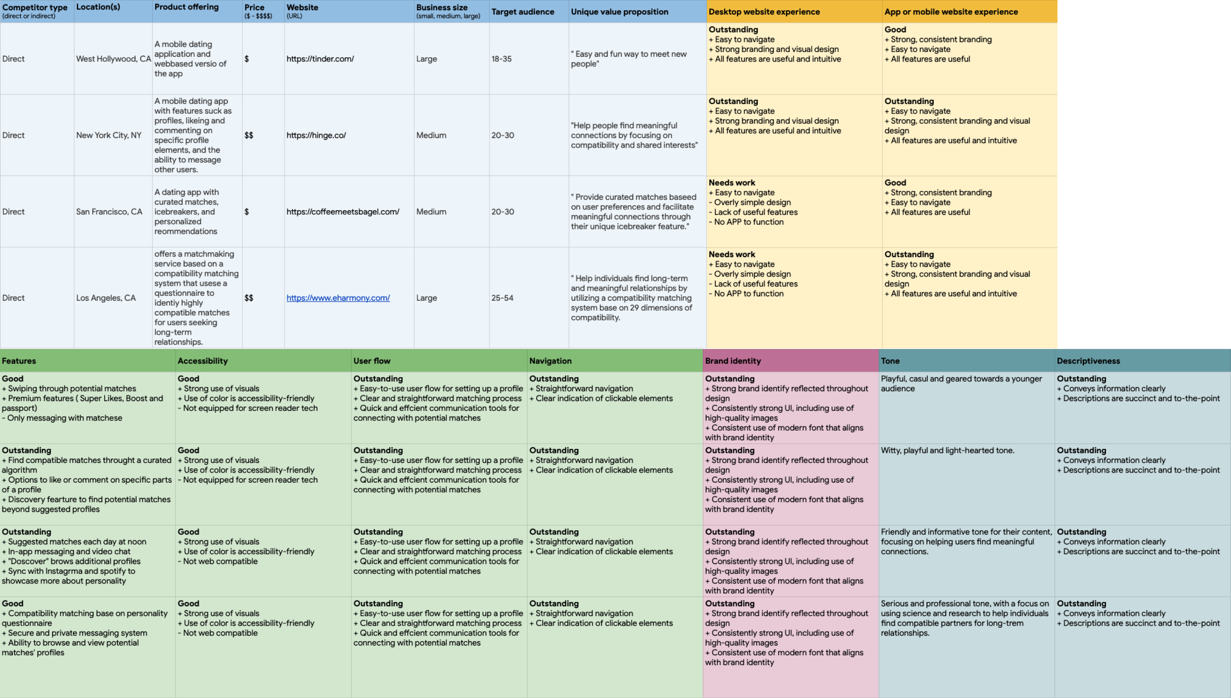
Tinder, a global market leader in online dating, distinguishes itself with a user-friendly interface, a diverse user base, and premium features, but faces competition from apps like Bumble and OkCupid while addressing data privacy concerns and maintaining a strong international presence.
Hinge, a key player in online dating, emphasizes meaningful connections, prompts, and user privacy, competing with Tinder and Bumble while maintaining steady growth.
CMB, is a notable player in online dating, recognized for its curated matches, emphasis on meaningful connections, and unique “Ladies First” approach. It competes with Tinder and Bumble in the dating app landscape, prioritizes user privacy, and continues to grow its user base.
eHarmony, a well-established name in online dating, distinguishes itself with its compatibility-based matching system and focus on long-term relationships, competing in the dating app space with platforms like Tinder and Match.com. The platform continues to prioritize user privacy and expand its user base.
Paper wireframes: Ideation
I conducted concise ideation session to address gaps pinpointed in the competitive audit. My primary focus centered on user-friendly features for profile management, match discovery, conversation management, and date scheduling to facilitate meaningful connections and successful relationships within the mobile dating app.
Starting the design
Digital wireframes
Low-fidelity prototype
Usability studies
Low-fidelity prototype
The low-fidelity prototype enabled users to manage finances and pay bills while having control over their financial information and payment methods. It also addressed privacy and security concerns with secure login and authentication features.
Digital wireframes
The transition from paper to digital wireframes provided a clear insight into how the redesign could enhance the user experience of the dating app by addressing pain points. As part of my strategy, I prioritized the placement of essential buttons and visual elements on the app’s interface to improve the user experience.
Digital wireframes
The discovery button works, but I think the placement confused me as the location and size indicates it has equal weight and importance to the interest and pass section.
Digital wireframes
Users found the past history button and section to be effective, but some had difficulty locating the button initially. One user commented, 'The past history button works great for me, but I couldn't locate it at first.' Additionally, users suggested incorporating more interactive elements, such as 'flower buttons' or other fun features, to enhance the ice-breaking experience."
Usability study: findings
Users found the past history button and section to be effective, but some had difficulty locating the button initially. One user commented, 'The past history button works great for me, but I couldn't locate it at first.' Additionally, users suggested incorporating more interactive elements, such as 'flower buttons' or other fun features, to enhance the ice-breaking experience."
Matches
Engagement with Artistic Features.
Navigation
Streamlined app navigation enhances user experience via intuitive design, aiding content discovery, and increasing engagement.
Messaging features
Desire for Enhanced Communication Tools.
Refining the design
Mockups
High-fidelity prototype
Accessibility
Information architecture
Mockups
Users showed a high level of engagement with the artistic features of the dating app, including the ability to showcase their creative work and interests. They appreciated the platform's focus on connecting individuals based on shared passions and inspirations, indicating a strong resonance with the target audience of creative individuals.
Before
After
Mockups
Users felt the wireframe was overwhelming and sought a simplified and intuitive experience with the dating app discover features, aiming to enhance relevance and promote engagement. This involves streamlining navigation, enhancing personalization, promoting exploration, and iterating based on user testing to improve overall satisfaction and engagement.
Before
After
Mockups
Users find the match feature intriguing but desire additional functionality for more interactive engagement. Opportunities for improvements include integrating messaging directly from the match screen, adding more profile details, highlighting mutual interests, and introducing gamification elements to enhance user experience and satisfaction.
Before
After
Mockups
During the wireframe study, users provided valuable feedback on the messaging feature. They highlighted the importance of intuitive navigation, clear message organization, and seamless interaction. Opportunities for improvement include enhancing message threading, incorporating multimedia support, implementing real-time notifications, and integrating facetime functionality to optimize user experience and foster meaningful connections.
Before
After
Mockups
High-fidelity prototype
The high-fidelity prototype maintained the user flow established in the low-fidelity prototype and incorporated design adjustments identified during usability testing, along with additional enhancements proposed by team members.
Accessibility Considerations
Accessibility
Careful consideration was given to color contrast and intuitive iconography for users with visual impairments.
Inclusivity
Alt text descriptions were added to all images, ensuring accessibility for visually impaired users.
Customization
Adjustable text size and font choices catered to users with varying levels of vision impairment.
Sitemap
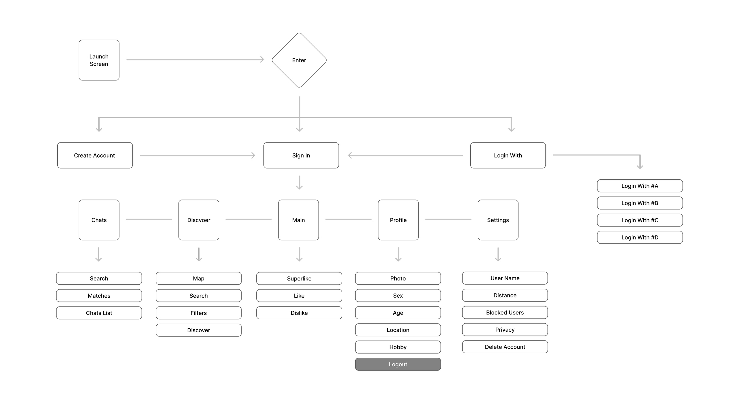
The low-fidelity prototype facilitated users managing their profiles and connecting with potential matches, ensuring control over their personal information and communication preferences. It also tackled privacy and security concerns by implementing secure login and authentication features.
Going forward
Takeaways
Next steps
Takeaways
Impact
The dating app offers user-friendly tools for profile management, match discovery, and conversation management to facilitate meaningful connections and successful relationships.
What I learend
I discovered that even minor design adjustments can greatly affect the user experience. My key lesson is to consistently prioritize the genuine needs of users when crafting design concepts and solutions for the dating app.
Next steps
Conduct follow-up usability testing on the updated dating app.
Identify any additional user needs and brainstorm new features.
Refining the design iteratively to guarantee ongoing enhancement and optimization.
Lets connect!
Thank you for your time reviewing my work on the Vibe Pair dating responsive app! If you’d like to
see more or get in touch, my contact information is provided below.


