Google UX design certificate project #1
Fast food APP Design
Project overview
Developed a mobile dedicated app for Lucky Star Burger to help 26.5% SoCal customers with language barriers. Includes dish images, customization, and language settings for easier, inclusive orders. Enhances efficiency, customer satisfaction, and inclusivity.
Date
Role
UX/UI + Research + Visual + Branding
June 2022 - July 2022
Tools
Figma
The problem
Busy workers and commuters who lack time the time to prepare a meal.
The goal
Design an app for Lucky Star Burger that allows all users to easily order and pick up freshly cooked burgers.
Understanding the user
User research
Personas
Problem statements
User journey maps
User research: summary
I conducted interviews and created empathy maps to understand the users I’m
designing for and their needs. A primary user group identified through research
was working adults and new immigrants who don’t have time to cook meals.
This user group confirmed initial assumptions about Lucky Star Burger customers, but research
also revealed that time and language were not the only factor limiting users from cooking at home.
Other user problems included obligations, interests, or challenges that make it
difficult to get groceries for cooking or go to restaurants in-person.
User research: pain points
Time
Immigrant adults who work and have limited knowledge of English often struggle to find time to learn a new language as they are busy earning a living.
Accessibility
Lucky Star Burger customers faced inconvenience as there were no online platforms available for placing orders. As a result, they had to rely solely on in-person visits or phone calls to place their orders.
IA
Text-heavy menus in apps can be challenging to read and order from. read and order from.
Persona: Vilen
Problem statement:
Vilen is a busy immigrant photographer who use a wheelchair and needs a faster, easier way to order food and wheelchair friendly environment to enjoy his meals because navigating in a restaurant in a wheelchair can be frustrating and Vilen need to get back to work.
User journey map: Vilen
Mapping Vilen’s user journey revealed how helpful it would be for users to have a committed Lucky Burger app.
Starting the design
Paper wireframes
Digital wireframes
Low-fidelity prototype
Usability studies
Paper wireframes
Using paper to ensure that the concept would address user paint point. For the home page,I prioritized a fast and simple ordering experience to help all users save time.
Stars were used to mark the elements of each sketch that would be used in the initial digital wireframes.Digital wireframes
Main navigation
In the initial design phase, I made sure to base the design on feedback and finding from the user research.
These buttons provides user friendly options for how they get their order.
This menu icon make it faster to find and order for the user.
Digital wireframes
Menus navigation
Edit at every step was a key user need to address in the designs in addition to equipping the app with a comment feature.
This button provides “updates my order” before the users confirmed the order.
Easy access to make comments about the users order.
Digital wireframes
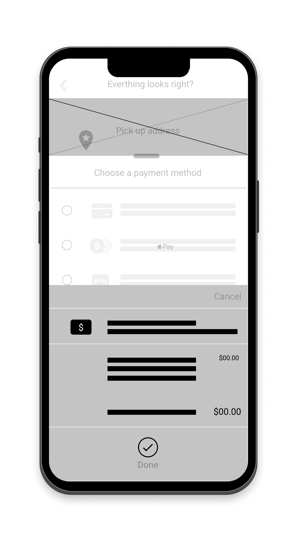
Payments navigation
Easy to use navigation and quick payment method to address the users need was introduced to the design.
This button provides an Pay at store option.
These options provides variety of payment method for user to choice from.
Low-fidelity prototype
The low-fidelity prototype connected the primary user flow of ordering and paying for a fast food meal, so the prototype could be used in a usability study with users.
User research: pain points
I conducted two rounds of usability studies. Findings from the first study helped guide the concept from wireframes to mockups. The second study used a high-fidelity mockups and revealed what aspects of the mockups needed refining.
Round 1
Most users felt the menu was confusing to navigate
Users asked for more contemporary payment options
Users need better cues for payment confirmation
Round 2
The customization process is too limited
The checkout action was confusing
Refining the design
Mockups
High-fidelity prototype
Accissibility
Mockups
Early concept design provided customization, however after conducting usability studies, it was clear that I needed to simplify the customization process. I also streamline the add to bag feature and added visual illustration to improve the user experience.
Before
After
Mockups
On the second usability study the frustration with the checkout flow was identify. To ensure a smooth checkout flow, I streamlined the flow by adding order summary screen, a continue to payment button and pick-up time options.
Before
After
Mockups
High-fidelity prototype
The final high-fidelity prototype presented cleaner user flows for customization and checkout.
Accessibility Considerations
Inclusivity
Provided access
to users who are vision impaired through adding alt text to images for screen readers. Offering pick-up or deleverying options to improve the user experience.
Simplify
Used easy to understand icons to help the user navigation experience easier.
Universalize
Used imagery for burger and toppings to help all users batter identify the design feature. Easy to understand iconography for newly immigrated users with limited language skills.
Going forward
Takeaways
Next steps
Takeaways
The app makes users feel like they are part of Lucky Star Burger family and that Lucky Star Burger really cater to the users needs.
When designing the Lucky Star Burger app, I learned that the initial concept for the app are only the start. Usability studies and keypoint from feedback influenced each iteration of the design process.
Next steps
Conduct another round of usability studies to check whether the pain points users experienced have been addressed.
Conduct more user research to determine any new areas of need.
Lets connect!
Thank you for your time reviewing my work on the Luck Star Burger app! If you’d like to
see more or get in touch, my contact information is provided below.


